
The badge
The story of Newcastle United's club crest
As iconic as our famous black and white stripes and as unique as the silhouette of St. James’ Park, our club crest captures the identity of Newcastle United and the city of Newcastle upon Tyne.
We take a look at our crests over the years, what they consist of and what their individual components signify.
1969 – 1976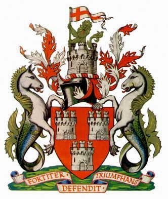
 Our shirts first had the city's Coat of Arms emblazoned on them as early as 1911, but it was in 1969 that the club finally adopted it as an official emblem.
Originating in the fourteenth century and formally recognised in 1954, Newcastle upon Tyne’s Coat of Arms is a depiction of the city’s history – with its Norman-era castle and two seahorses (added in 1575) to signify seafaring heritage.
On the crest section, a demi lion sits atop the city’s historic Castle Keep and flies the swallow-tailed pennon of the Arms of Saint George – the country’s patron saint.
The Coat of Arms also features the city’s Latin motto, Fortiter Defendit Triumphans – ‘Triumphing by Brave Defence’ – adopted following a brave and stubborn resistance against the Scots in 1644.
1976 – 1983
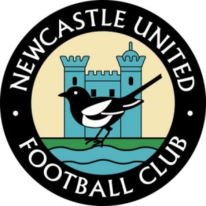
The first club-specific crest was created in 1976 and it retained an illustration of Castle Keep – which still stands imposingly in the city today.
The River Tyne was also added, with a magpie - a nod to the club’s nickname – in the foreground.
A black outer ring, bearing the name ‘Newcastle United Football Club’, completed the design.
1983 - 1988
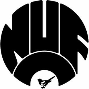
Despite having a shelf life of only five years, the club’s next crest remains somewhat of a cult classic.
Circular in shape and with a bold simplicity, it contained only the letters ‘NUFC’, with the solitary magpie retaining a presence in the opening of the upturned ‘C’.
1988 - present
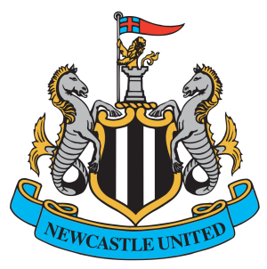
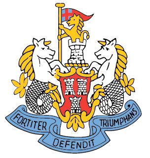
The club’s current and perhaps most famous crest – synonymous with the Entertainers Era of the mid-nineties – was created in 1988.
It heralded the return of the overall shape and several elements from the city’s Coat of Arms, namely the supporting seahorses, castle, demi lion and an amended pennon.
Inside an inner shield, gilded in gold, the club’s black and white stripes were added while the club’s name was added in a grand, scrolling blue banderole.
In recent years, a tonal black or white crest has been used, giving the club's kit and branding a simple, modern feel.
125th Anniversary crest
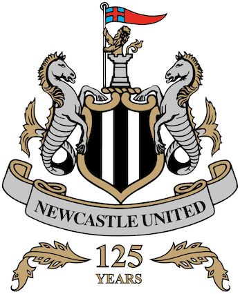
Newcastle United celebrated its 125th anniversary during the 2017/18 season and a special commemorative crest was commissioned as part of the club's celebrations.
The gold and silver design was based on the Magpies’ existing crest and a golden adornment was added to signify the milestone year.
The new variation appeared on the club’s classic black and white stripes and also featured on away and third kits throughout the club’s anniversary campaign.
Newcastle United was formed in the summer of 1892 when Newcastle East End absorbed the assets of city rivals Newcastle West End, including the lease of St. James’ Park.
A new name for this stronger, unified club was chosen and ‘Newcastle United’ was officially recognised that same year on 9th December.
You can find out more about Newcastle United's long and illustrious history at www.nufc.co.uk/club/history.